Kyvio Blog
The Ultimate 25-Step Guide to Creating a Cash Cow Landing Page
This is a guest post from Nabeel Keblawi – a professional sales copywriter who helps companies convert website traffic into qualified leads and paying customers, optimize their sales funnels, improve direct response, and achieve higher page rankings with SEO.

I’m sure you’ve already read some online resources on writing landing pages.
But they’re mostly thin and unsatisfying content that barely scratches the surface. It doesn’t really give step-by-step directions to create a landing page that actually converts!
Instead of playing Google-Fu to cobble things together, what you need is all right here on this very page! I even include links to excellent resources you can use along the way.
However, don’t start writing your landing page right off the bat.
You need to lay some groundwork first.
If you want your landing page to become a cash cow, it is absolutely essential that you go through all the preparatory steps before you write a single word in your landing page.
1. Determine your main objective

First things first, you need to decide what you want to achieve in your business.
Whether you want to raise brand awareness, boost sales, or get more email signups, the landing page should align closely with your primary business goals.
Whatever you do, don’t skip this step!
2. Decide on campaign metrics and KPIs
Once you decide on your main objective, you need to choose where your landing page fits into your marketing campaign.
Get specific when you decide on the conversion metrics (e.g. click-through rates) and KPIs (e.g., the target number of email subscribers) that you will use to measure the success of your campaign.
3. Gather information about your target market
Once you have the objective and the campaign metrics written down, it’s time to take a good long look at the people you want to persuade to take action after reading your landing page.
What makes them tick?
What do they want?
How can you solve the problems that keep them up at night—today?
4. Create an ideal customer profile
Using the information you gather in step 3, you need to make a profile of your dream customer.
Imagine you’re talking about your product or service with that ideal customer, and they get so excited about it that they practically beg you to take their money.
Who is that person?
What’s their demographic?
Where do they work?
Are they married? With kids?
What are their values?
Here’s an easy way to get this all down on paper: the free Customer Avatar Worksheet.
5. List at least 3 pain points
Once you have that ideal customer profile, it should be straightforward to list some of their pain points.
While you haven’t done an in-depth analysis of the features and benefits of your offer (that’s the next step), you should have a pretty good idea of which pain points you can solve and for whom.
The key here is to choose three pain points that are most relevant to your offer. That is, the ones you CAN solve.
6. Analyze the features of your product or service
Now it’s time to look internally at your own offering.
What does your product do or have?
What service are you offering?
What tools, characteristics, and capabilities are featured in your offering?
Make a list. Don’t hold back.
For example, some kitchen ovens have self-cleaning, timers, multiple racks, stainless steel finishes, and convection features.
7. Translate features into benefits
Benefits are the reasons people buy your product or service.
Rather than focusing on the features or characteristics of your product, benefits are more about how it eliminates the pain points your prospects are struggling with.
Do the benefits of your product directly address the pain points you listed in step 5?
If so, you are ready to write your value proposition.
Otherwise, you need to think more about how your product actually helps your prospects, possibly redoing steps 3 through 6.
8. Write your value proposition
As the most crucial element of your offer, your value proposition tells your prospects why they should do business with you instead of your competitors.
Don’t waste this golden opportunity by using trite cliches, buzzwords, and meaningless slogans.
Some businesses don’t even highlight their value propositions on their websites!
Put some thought into your value proposition, make it concise and meaningful, and plan to include it near the top of your landing page. Do so, and you’re already ahead of the game.
9. Competitive analysis
Next, scour the Internet for people offering similar products and services. Look at reviews and testimonials. Poke around for “market gaps” and even negative reviews or complaints.
You could carve out a place in the market by doing things better or offering more value than your competitors.
10. Write down your USP
Your competitive analysis should give you some ideas about what makes your product unique.
Next, you want to write down a statement or two explaining why your offer is different (and better) from that of your competitors.
This is a unique selling point, which sets you apart from competitors.
Having a USP that demonstrates value to your prospects shows them why they should pay more to do business with you instead of paying less to your competitors.
11. Write down what you want your prospect to do
So your opportunity reads through your landing page. Great! Then what happens next?
Specifically, what do you want your prospect to do?
Don’t just say “contact me” or “buy my product now”.
Instead, be more specific.
Do you want them to sign up for a webinar? Opt-in to your list where you can engage them by email? Put your product in their cart? Fill out a request form for your service?
What you want them to do mainly depends on the nature of your product or service, how much it costs, and whether you have a funnel that nurtures your prospects over time.
12. Decide where to place your landing page in your funnel
Your landing page is one of the most important stages along your sales funnel.
For example, if you are using Facebook ads to get webinar signups, you simply drive clicks from your ad to your landing page, where readers can sign up with their email address.
Landing pages are a great way to promote each stage of your sales funnel and convert your prospects to the next step.
Decide which part of your funnel you are writing this landing page for. Alternatively, you can hire a company to build your sales funnel.
13. Compile a creative brief using information from steps 1-12
The creative brief is your go-to document about any aspect of your landing page. It should have the following:
Brand statement
Overview of the campaign’s objectives
Key challenges to resolve
Target audience
Main competitors
Market positioning
Features and benefits
Communication channels for your campaign
This is the foundation of your campaign you are about to create. If you get stuck in the later steps while writing your landing page, your creative brief is there to help you.
Need to clarify the benefits? Check your creative brief.
Need to get some ideas for your call to action? Check your creative brief.
Want to decide which pain point to emphasize? Check your creative brief.
14. Create a landing page template
A landing page has two main parts.
The first part is the above-the-fold section, which is the area that visitors see on their screen when they first visit your landing page without scrolling down. It should contain your value proposition.
Once they scroll down, they will see the second part, the below-the-fold section, where they will read customer-focused copy with pain points and benefits. You should also address any objections, include social proof such as testimonials, a money-back guarantee, and a CTA.
15. Brainstorm your headline and tagline
Your headline is the most essential part of your landing page.
Visitors will decide within 2 seconds whether or not they will stick around, so you’d better make it good.
Your headline only has one single goal:
To get readers to read the next line. That’s it!
The next line would be your tagline. This is a great chance for you to clarify what you couldn’t fit into the headline. Your tagline would usually contain a concise and impactful summation of your value proposition.
Use the creative brief you generated in step 13 to help you brainstorm!
16. Brainstorm a few CTA variations
Your call-to-action is one of, if not the most important element of your landing page. The CTA is the one thing that spurs the reader to take action.
The CTA should be based on step 11: what you want your prospects to do once they read your landing page.
It should be no longer than a few words. Large boldface font within a button is best. High-contrast colors will also help make it stand out.
Here are some CTA examples from HubSpot.
Sometimes I even use two or three CTAs of slightly different flavors throughout the landing page instead of just one, making it easier for them to act upon their “buy now” impulse.
17. Write multiple variations of your offer to address pain points
Next, you need a statement that increases the reader’s interest and desire to buy from you.
Now, this is where the rubber meets the road. Many a copywriter have failed in this step, resulting in landing pages that get a lot of traffic, but conversion rates are shit. Sound familiar?
Under the tagline, this statement must be concise but meaningful. Don’t use flowery language, tired cliches, or meaningless slogans.
Take your value proposition from step 8 and your USP from step 10 and combine them into a sentence or two that addresses the most pressing pain points.
18. List the benefits of your offer
You already know your own offer inside and out, and why people should take you up on it.
But you need to put that on paper.
Beyond the most obvious ones, it takes some time and creative thinking to tease out the benefits of your offer. Personally, I like this method of teasing out those benefits. The question you should ask yourself when thinking about the features of your offer is “so what?”
Don’t forget to consult your creative brief. That’s what it’s for!
19. Anticipate objections and address them
As they move down your landing page, it is inevitable that the reader will come up with their own misgivings, which stem from the fear that they’re about to make a bad investment.
So their mind jumps into high gear, creating excuses as to why they can’t buy your product or service. If you don’t anticipate this, your readers will stop themselves from buying and leave the page.
Your job is to anticipate what objections they will use to talk themselves out of buying—and overcome them. How? One word:
Reassurance.
They are looking for reassurance that they’re getting the value that they’re paying for.
20. Include testimonials and a guarantee

So you’ve anticipated and overcome your readers’ objections. Your readers, at this point, are almost ready to buy.
But they need some social proof.
They need to know that you’ve already helped others with the same problem before. They want a guarantee that their problem will disappear after they pull out the plastic.
If you have glowing testimonials or case studies, use them!
No testimonials? No problem. Just offer them a 100% money-back guarantee if they aren’t fully satisfied with your product or service.
21. Finish with a strong CTA
While you’ve gotten this far, you won’t reap the benefits of all this hard work without a strong call to action.
You should already have at least a few CTA variations from step 16 ready to go, perhaps with a bit of tweaking. The final CTA should be eye-catching and bold enough that it practically reaches out and grabs readers by the collar.
Feel free to experiment with a few colors, contrasts, button sizes, and fonts. While you’re at it, take a look at these UI design tips.
22. Write your meta description using SEO keywords
A meta description is a snippet of up to 155 characters that summarizes a page’s content.
This is a chance for you to insert some keywords about your product and explain how it benefits the reader. It’s a great way to pre-qualify readers even before they visit your page. Your visitors would already know one of the benefits you are offering, rather than blindly stumbling in (and leaving soon thereafter).
Use an SEO keyword tool to get keyword ideas for your landing page and its meta description. For WordPress users, Yoast has some excellent resources on creating enticing meta descriptions that help increase your page rankings.
23. Guide your visitors to the next step of your sales funnel
With your sales funnel mapped out, directing your visitors to the next step after clicking that CTA should be straightforward.
A “Buy Now” or a “Claim Your Free Trial” CTA should direct visitors to a purchase form.
Or, to save your readers one click, a small email form should lie just above the “Sign Up” CTA on the same page. Once they click, your readers should soon receive an email from your autoresponder.
Either way, you need to engage with, nurture, and guide your leads through the rest of your funnel. If you play your cards right, those clicks will directly translate into dollars.
24. Create a variant of your landing page for A/B testing
Did you have trouble deciding which variations of your headline and CTA to use?
Fret not. Here’s your chance to A/B test them against each other.
How does this work?
Basically, you create a copy of your landing page, swap the headlines and calls to action, and display each to roughly the same number of visitors. After a certain amount of traffic, you compare the conversion rates on both landing pages. Some online tools and plugins also allow you to easily A/B test against your published landing page.
BONUS TIP: CrazyEgg found through A/B testing that long-form pages have 30% higher conversion rates than shorter ones.
25. Measure conversions, tweak accordingly, and retest
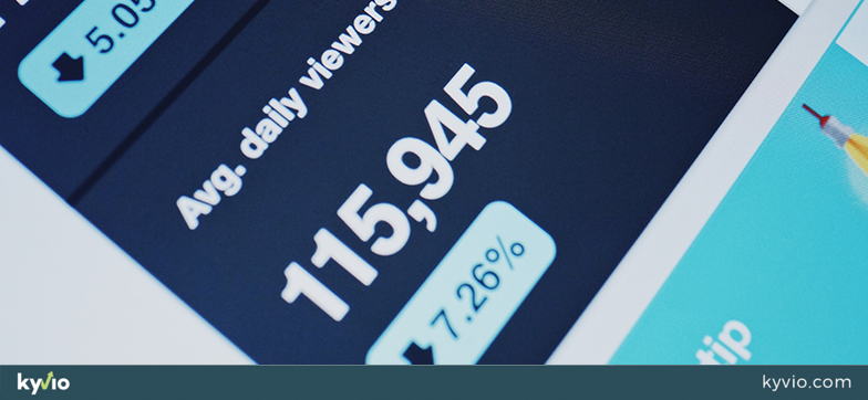
Once some traffic rolls in, you should have a good idea of your conversion rate, bounce rate, and how long people stay on your landing page.
All these metrics will show you the strong and weak points of your page, revealing a lot about where you might be losing your visitors. If you use WordPress, you could install a heat map plugin to see where people are spending the most time on your page!
With your A/B test results in step 24, you will know which headlines and CTAs perform better. The key is to tweak and retest, rinse and repeat until you maximize your conversion rate. This can be an iterative process that can take a few weeks or even months.
Closing Remarks
It’s usually best to draft the landing page in a basic word processor first. Once you’ve made all your edits, you can migrate the text to your web page right before publishing it.
Finally, you don’t even need to be a world-class copywriter like David Oglivy or Gary Harbert. Once you lay in your groundwork using the first dozen steps in this guide, your landing page will practically write itself.
If you could take away only a few things out of this guide, I would suggest these:
Think about what you want your prospects to do—and be specific!
Focus on tweaking your headlines and CTAs until you find a winner.
Write as if you’re explaining your offer to a friend over lunch.
Then milk the damn cash cow to your heart’s content!

